Brand:
Nuditae
Project type:
Logo · Color · Typography · Brand Guidelines
Role:
Brand design · Art direction · Visual system
Scope:
Branding + Packaging
Year:
2021
THE PROJECT
Nuditae is a sex-positive platform built for people who are tired of hiding. A virtual space for straight women and the LGBTIQA+ community to explore, express, and own their sexuality without shame.
Based in the Netherlands, Nuditae is set to be the app that flips the script on how sexual content is usually framed. A place for every body.
INTRO
Nuditae started with a founder who had a strong vision for the platform, but no clear visual direction yet.
She knew what the brand needed to stand for: sexual freedom, body confidence, safety, and a space that felt welcoming for women and the queer community. My role was to help turn that into a visual identity — and to guide the process without defaulting to what the category usually does.
The tricky part was obvious: the brand was about showing skin, but it still needed to feel safe, classy, and not explicit for the sake of it.
So the question became: how do you show the body without making the brand feel vulgar, cold, or like every other adult platform?


MOODBOARD FOR THE CHOSEN CONCEPT
FINDING THE DIRECTION
In the concept phase, I presented two directions.
One route used fruit and everyday objects as a playful way to suggest sexual themes without showing body parts directly. It could have worked visually, but the founder pushed back. And she was right.
Her point was simple: if the app is about people feeling free to show their skin, the brand could not look like it was avoiding or hiding skin. That pushed us toward the stronger route: a body-led identity that showed skin, but treated it with softness, mystery, and control.


THE ART DIRECTIon
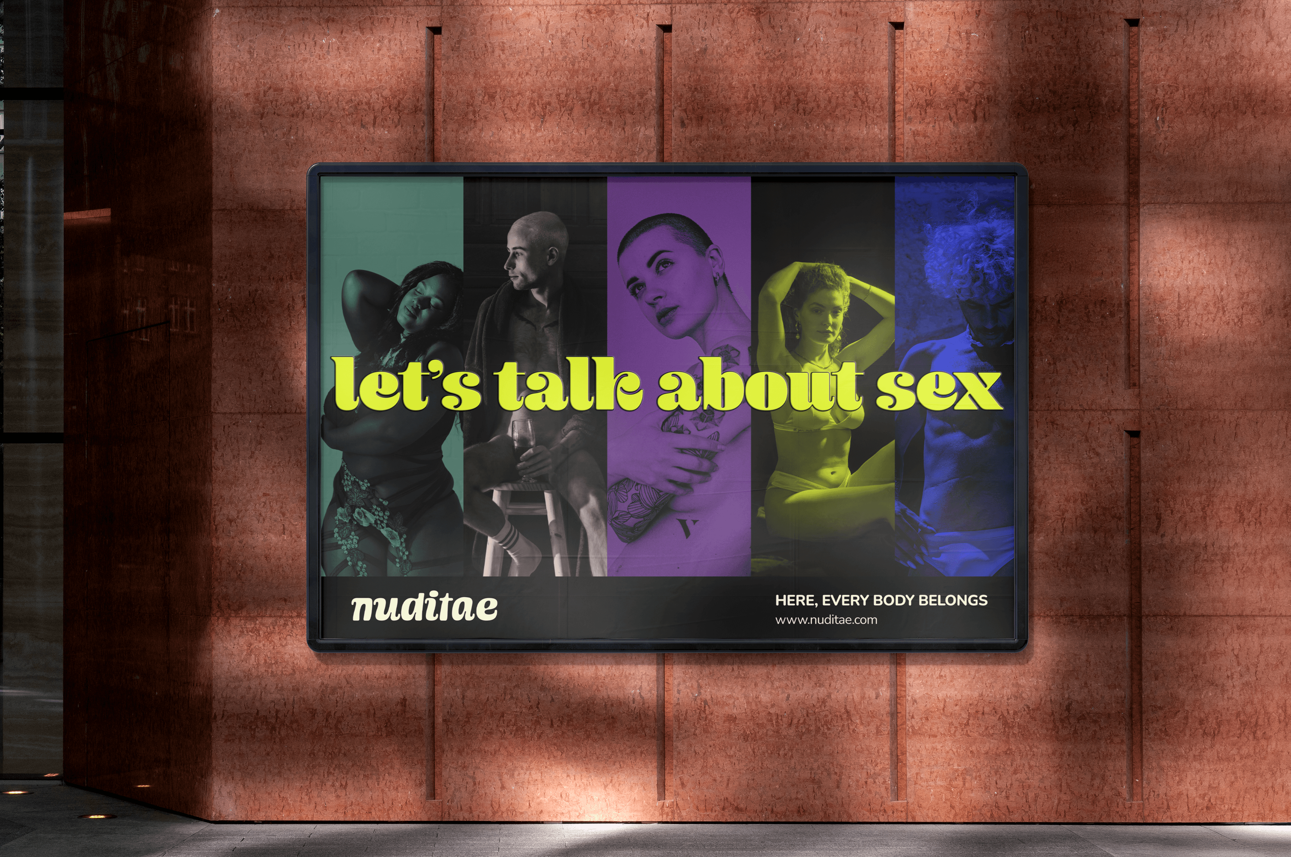
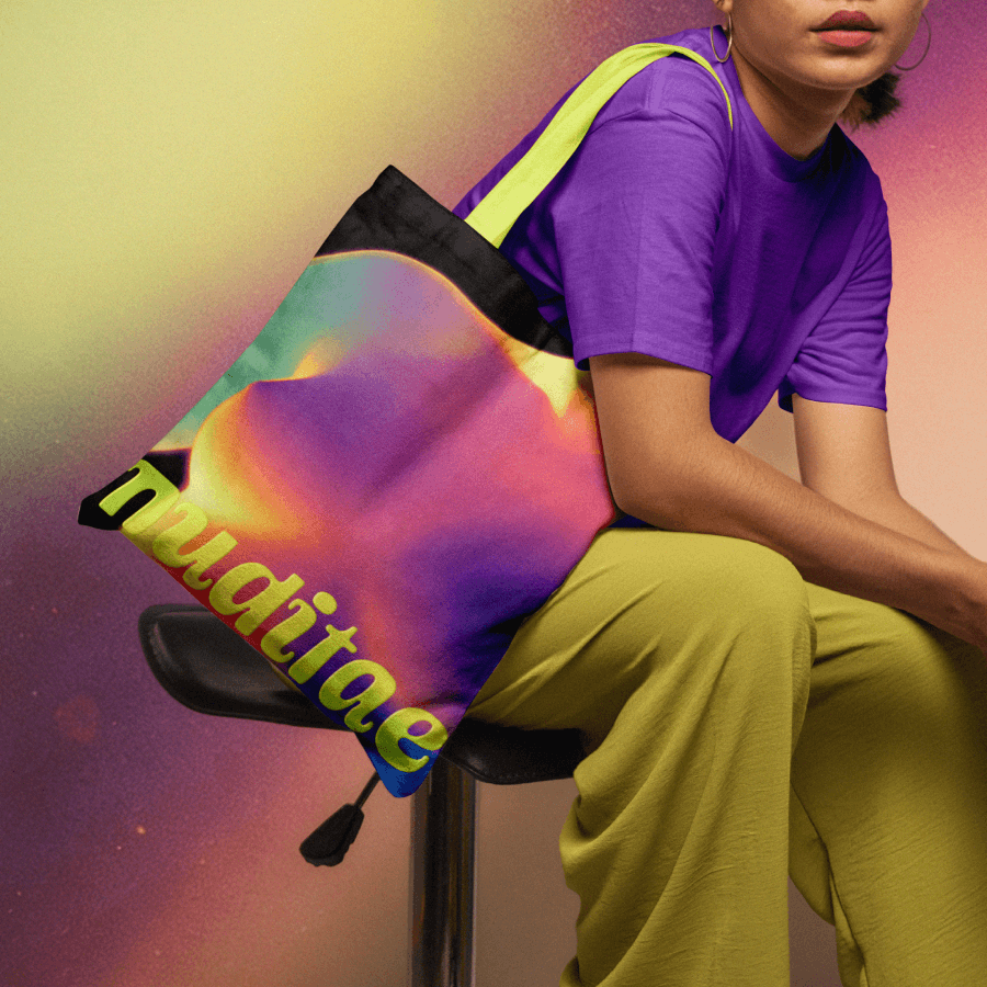
The final direction used gradient-map photography, warm colors, soft contrast, and body-led crops that felt sensual without being too literal.
The body heat map idea became a key part of the graphic language. It gave the brand a modern way to talk about heat, intimacy, and sensation without relying on obvious nudity or adult-category clichés.
It made the imagery feel more mysterious and less exposed. You could feel the body in the work, but it didn’t shout. That balance was the whole point.

Why it mattered
This project asked for a very specific kind of taste.
Too safe, and the brand would lose the point. Too explicit, and it would stop feeling like a safe space. Too abstract, and it would feel like it was hiding from its own purpose.
The final identity found the line between sexual and sensual, bold and welcoming, skin and privacy.
For me, that was also personally meaningful. As someone who could relate to the target audience, it felt important to design a brand that did not treat queer or female sexuality as something awkward, overly polished, or performatively edgy.


