
Brand:
Lingoda
Project type:
Rebrand Rollout · Creative Systems
Role:
Lead Designer for brand development and rollout
Scope:
Web · CRM · Paid · Social · Decks · Templates · AI imagery · Illustrations
Year:
2026
THE PROJECT
Verve Agency led Lingoda’s strategic rebrand. I led the internal design development and rollout, translating the new direction into AI imagery workflows, illustration systems, Figma templates, and 1,000+ exported assets across the company.
WHY THE REBRAND WAS NEEDED
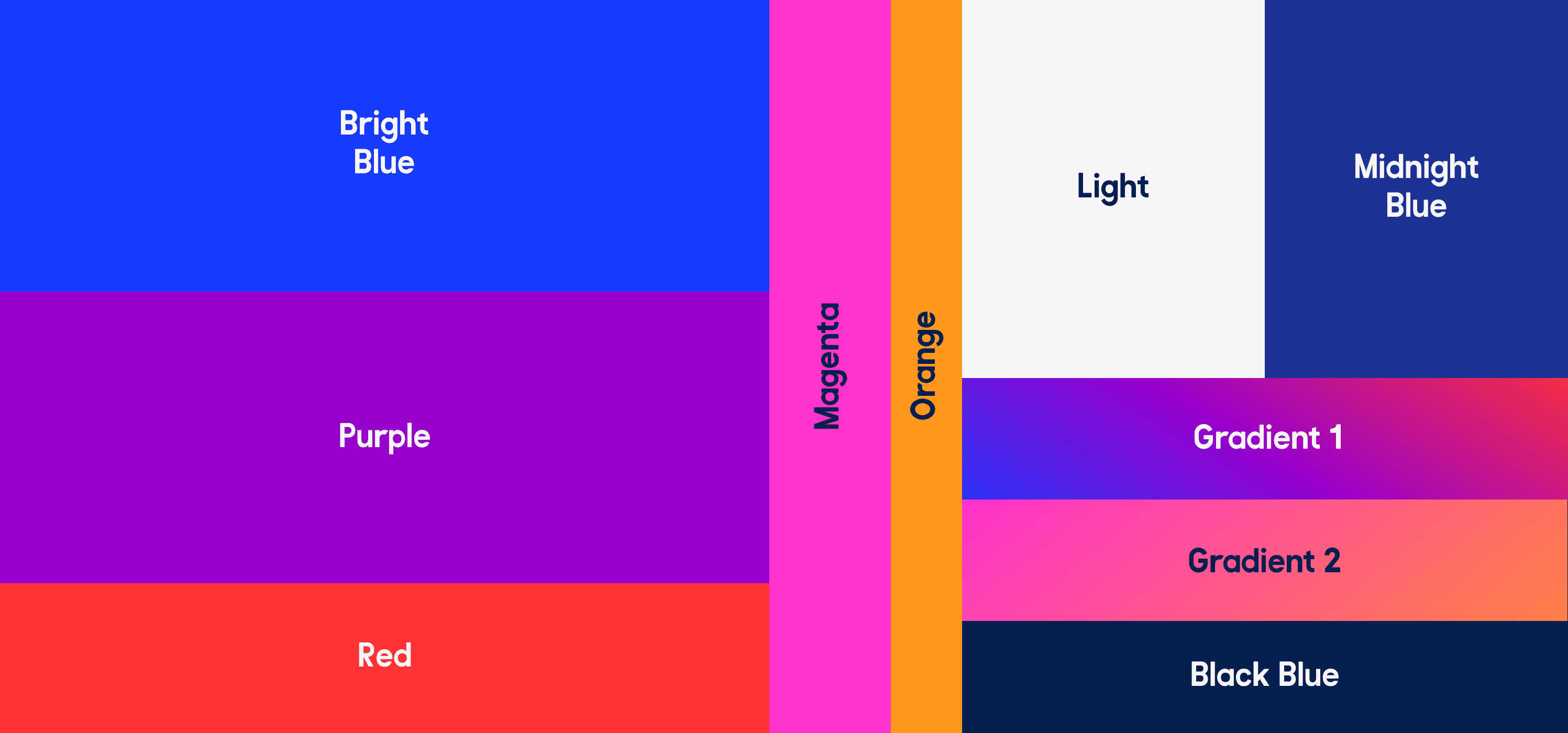
Lingoda’s old brand no longer matched the product, the audience, or the direction of the company.
The visual identity felt too broad, too pastel, and too playful for a brand moving towards internationally minded professionals: people relocating, working remotely, building careers across borders, and learning languages for real life.
The biggest issue was imagery. Lingoda relied heavily on stock photography, especially generic laptop scenes that felt cold, staged, and repetitive. The new brand needed to feel warmer, sharper, more credible, and easier to scale across daily marketing needs.

THE EVOLUTION OF THE IMAGERY STYLE BY SWITCHING FROM GENERIC STOCKTO ART DIRECTED AI IMAGERY.

THE STRATEGY
My focus was to make the new brand usable beyond launch day.
I built the rollout around reusable systems: AI prompts, Figma templates, variants, automated layouts, and visual rules that helped teams create consistent work faster.
A major decision was moving Lingoda away from stock imagery and into a 100% AI-powered image and video workflow. The goal was not to make the brand look artificial. It was to make it feel more human, more specific, and more ownable than the stock visuals we had before.


NEW APP STORE EXPERIENCE

CREATIVE DIRECTION
The new imagery direction was built around believable ambition.
I researched references from cinematography, cinematic stills, lighting, grain, color grading, and art direction to define a warmer, more realistic visual style.
The scenes focused on real-feeling moments: preparing for meetings, joining classes, learning at home, working remotely, moving abroad, and building confidence in another language.
To make the SaaS experience visible without relying only on screenshots, I introduced selected product UI elements into the imagery (class cards, notifications, pop-ups, and app-inspired overlays). This helped the brand feel more modern, more product-led, and more connected to the learning experience.

WEBSITE ALWAYS-ON HERO BANNERS for OVER 40 pages developed.


SYSTEM BUILT TO SHOW THE UI OF THE PRODUCT IN A CONSISTENT, CREATIVE AND SCALABLE WAY, USING GLASS FRAMEs AND illustrations.
ILLUSTRATION SYSTEM
Alongside the AI imagery direction, we built a new illustration and vector image system for the rebrand.
Together with another designer, I created 300+ illustrations and vectorized assets based on the new style created by the agency. The goal was to move away from the old childish illustration language and create a sharper system that could support CRM, social, web, decks, lesson materials, and internal templates.
The illustrations gave Lingoda more flexibility beyond photography, while keeping the brand consistent across different formats and levels of complexity.
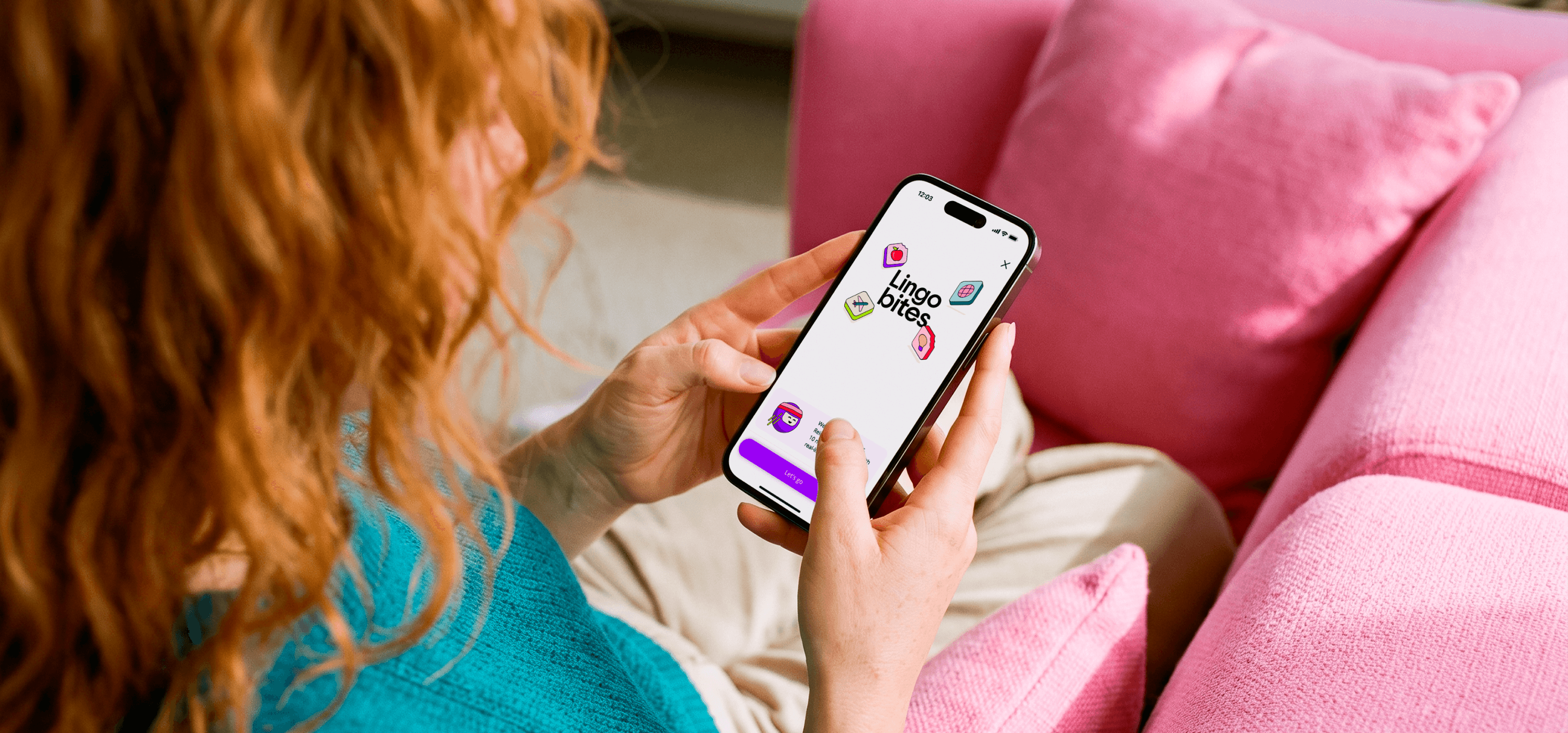

NEW APP EXPERIENCE WITH RENOVATED COLORS AND COMPLETELY NEW ILLUSTRATION STYLE.
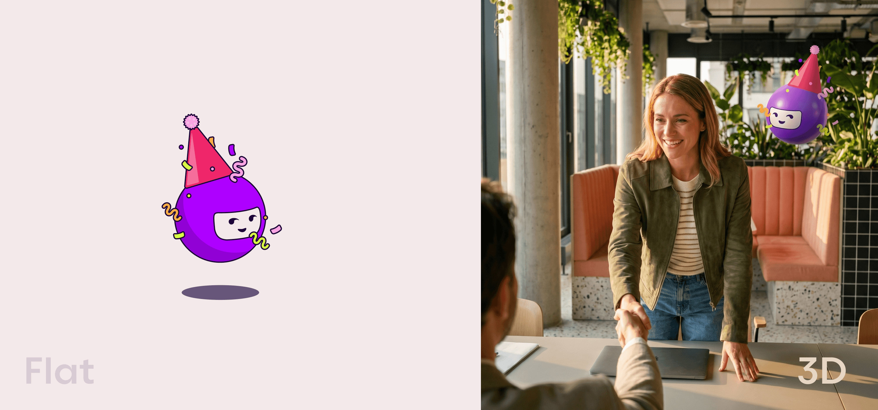
THE ILLUSTRATIONS WERE BUILT ALONG CUSTOM PROMPTS TO RECREATE THEM IN 3D CONSISTENTLY.


MAKING IT WORK
The rollout was built in Figma and Higgsfield for AI photography.
For imagery, I created B2C and B2B master prompts with the brand’s visual rules already embedded, so teams could change the scene, character, or background while keeping the output consistent. I also set up Lingoda’s visual style in Higgsfield and refined key assets in Photoshop when extra realism was needed.
In Figma, I built reusable templates for company presentations, lessons, social content, paid ads, CRM modules, and rollout assets. These used variants, automated layouts, and clear structures so designers, marketers, and other teams could create on-brand materials without rebuilding everything from scratch.
THE ROLLOUT
The rebrand was applied across Lingoda’s main brand and marketing touchpoints: website imagery, CRM templates, paid ads, organic social, internal decks, lesson templates, and brand support materials.
I led the rollout workflow, guided another designer through production, and helped make sure the new brand could scale across hundreds of assets while still feeling consistent, warm, and on brand.

SOCIAL MEDIA ASSETS WITH THE NEW LOOK

AFFILIATE ASSETS - BUILT WITH FIGMA AUTOMATIONS FOR TRANSLATIONS AND MULTIPLE FORMATS
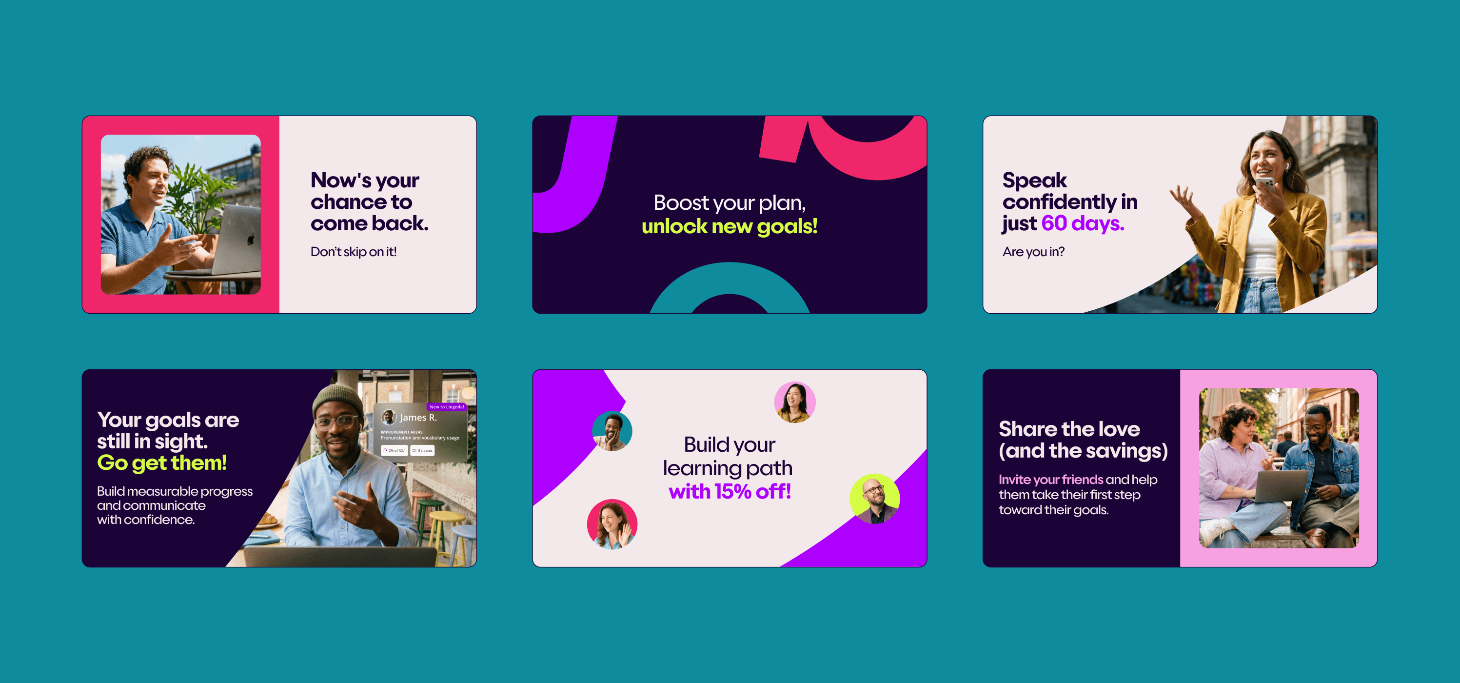
CRM email banner templates

SOME OF THE SOCIAL MEDIA TEMPLATES CREATED TO SUPPORT FAST TURNAROUNDS.

